
Redesigning a responsive website of a local bike shop

Role
UX designer
Education program
UX Academy, by Design lab
Company
King Kog Bicycles (Brooklyn, NY & Oakland, CA, USA)
Context
The company
King Kog Bicycles is a business owned by Gina Marie Scardino with two cycle shops, one in Brooklyn, NY, established since 2005, and another in Oakland, CA opened more recently, in 2014. Besides selling vintage, new and custom bicycles, they offer maintenance, repair and custom design services.
They are well known in the cyclist community for sponsoring and organizing racing events, and as they’ve grown, so has their customer base, expanding to casual cyclists, commuters and sport-enthusiasts.
However, after time the brand had diluted across their blog, online store and social media, which meant it was time to redesign their website.
The Education program
UX Academy is a Mentor-led, online design education program by DesignLab, a company offering high-quality design education online, based in San Francisco, CA, USA
Challenge
Re-vamping the online experience of a local classic shop
The main challenge was to redesign the King Kog Website to bring together their store, blog and online community into one place. This also meant updating the brand a little to make it feel more professional but keeping their authentic look.
Finally, the approach needed to consider responsiveness to allow customers to also make purchases online through their mobile devices.
Constraints
There were two main constrains at the beginning of this project: time and location. Only 40 hours were allocated to this project from begin to end, which meant I had to move fast and prioritize delivery over a polished product. Also, being located in Mexico City at the time, I was unable to get direct access to customers in Brooklyn or Oakland.
Process
After carefully reviewing the brief, and given the aforementioned constraints, I decided the best in this case would be to follow the Design Thinking Process to quickly move through the different phases of design, without looking away from the user.
As part of the planning, these design goals for the project:
Plan a discovery phase including a competitive analysis of businesses in the cycling market to gain industry insight, understand feature priorities and identify key areas of focus for user research.
Carry out user research to identify priorities from the user’s perspective, usage trends, and opportunities for design enhancements.
Create wireframes, mood boards, visuals and other design artifacts that describe in detail the look and feel of the proposed redesign and features.
Build a working prototype which meets use cases as identified during research to showcase the end result.
Research
& Strategy


Research plan
To gain as much insights as possible about King Kog’s culture and customers, I created a research plan consisting of three parts:
Plan a discovery phase including a competitive analysis of businesses in the cycling market to gain industry insight, understand feature priorities and identify key areas of focus for user research.
Carry out user research to identify priorities from the user’s perspective, usage trends, and opportunities for design enhancements.
Create wireframes, mood boards, visuals and other design artifacts that describe in detail the look and feel of the proposed redesign and features.
Build a working prototype which meets use cases as identified during research to showcase the end result.
Competitive analysis
To understand better how King Kog’s offer through their website is different from their competition, I selected 4 other local bikes shops from the Brooklyn area with similar community culture and passion for bicycles. These shops were selected based in location (they are all near King Kog), style, and digital presence (they all had websites and activity in social media).
This analysis presents weaknesses and strengths identified in the websites of these businesses, which served not only to assess how King Kog stands out but also to inspire possible features for the ideation stage.
As part of this report, I created a Feature Matrix to compare the offerings of these businesses online. We can see King Kog has a somewhat complete website, however there are several weaknesses we must address.
Interviews
Using the interview guide I created as part of the research plan, I had personal conversations with three cyclists to ask in depth questions about how they use their bicycle in their day to day, how they maintain it, when do they go to the shop and so forth.
From the interviews recorded I highlighted the insights and quotes that provided a window to their habits and preferences.


UX Design


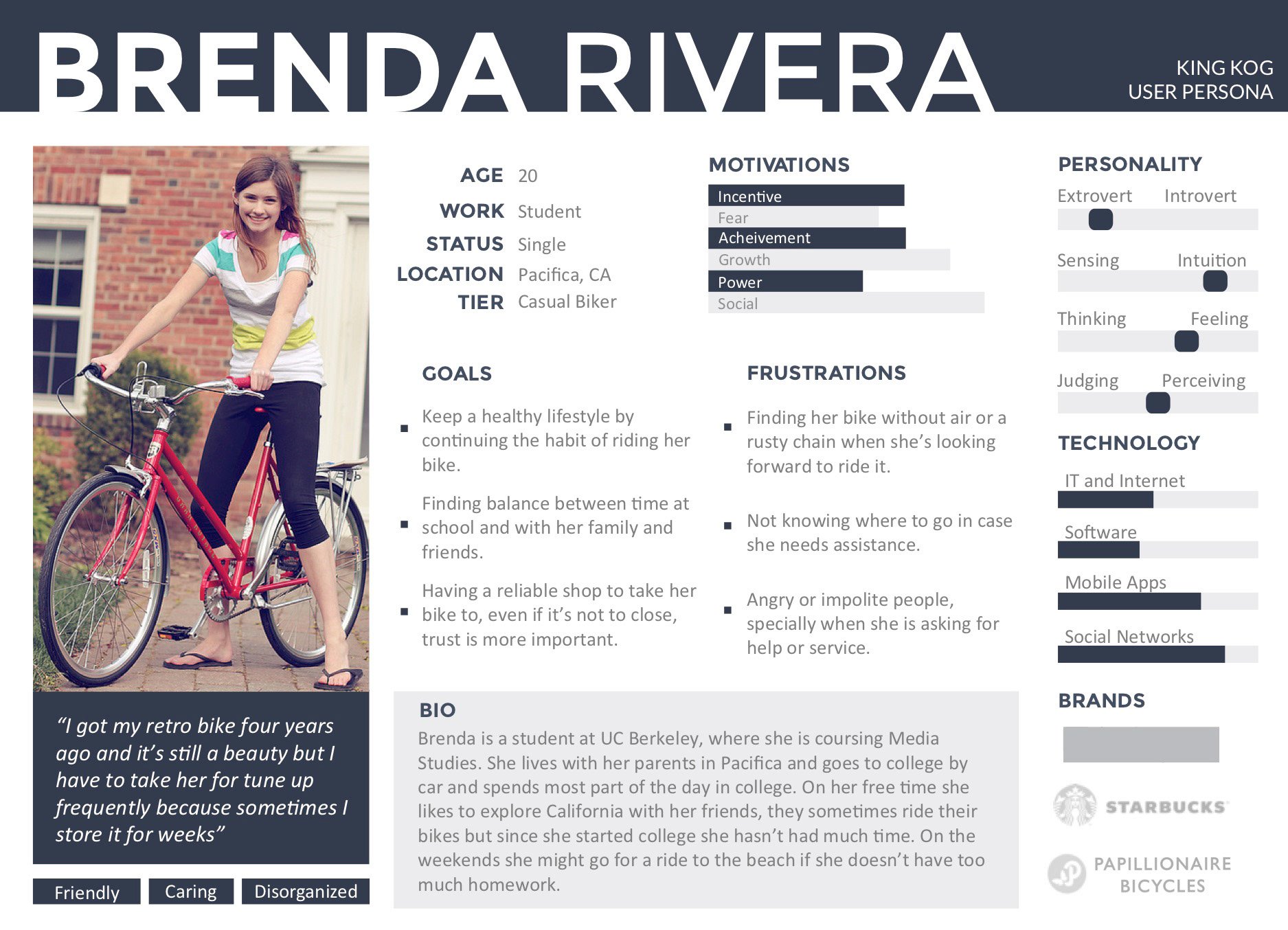
Personas
With the results from the user research I decided to create the personas that would help guide design decisions, priorities, and increase empathy throughout the project.
UX Strategy

With the results from the user research I decided to create the personas that would help guide design decisions, priorities, and increase empathy throughout the project.

Website Architecture & User Workflows
Next step was to start putting these insights and plan into action. With the clear goal to have an Minimum Viable Product by the end of the week, I decided to focus on two main user tasks: registering for an event and purchasing an item from the online store.
I started by sketching the information architecture in a sitemap and then included the workflows to visualize how the user would navigate through the site for each of the tasks.

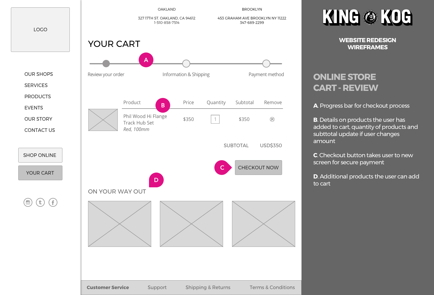
Wireframes
These workflows provided a clearer picture of the screens that would need to be created, so I did several versions of wireframes, where I experimented with different hierarchy on the elements, navigation patterns and content structure.
The wireframes, for both mobile and web, covered the homepage and online store, including all necessary screens to make a purchase. All wireframes include annotations to communicate expected interaction to developers and stakeholders.


Moodboard & Style Tile
Before jumping into visual design, I spent some time gathering inspiration and deciding on a style, by looking at King Kog’s pictures and swag I explored different ideas, they were all a bit vintage, finally, I decided for a retro 80’s neon look.


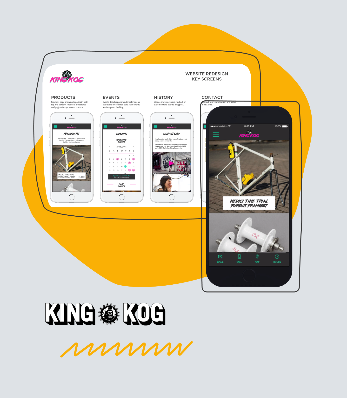
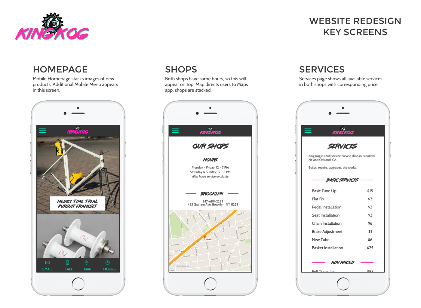
Styled Key Screens
To build the prototype and review my styling choices in action, I took the final mobile wireframes previously created and styled them with the elements I had built for the Style Tile.

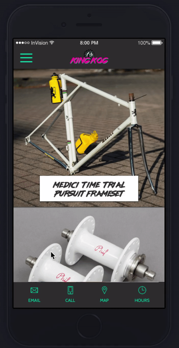
Prototype
To test the redesign on mobile, I created an InVision prototype to see how it would feel in a small device and to test the navigation and quick menu, since I knew this was a bit of an uncommon pattern for mobile. However, being responsive web, I wanted to experiment a with a quick menu to the shop's points of contact on the homepage.
UI Kit
As part of the final deliverables I put together a UI Kit with all the minimum components necessary to build the interface and that would be reused by both design and frontend to build future screens. This way, consistency was promoted from the start.

Lessons learned
The research on this project gave me a more personal understanding on the power of talking and observing users. It’s very unfortunate I could not do it in the actual stores, since most likely this would’ve produced very different insights. Nevertheless, it was a great exercise to plan, execute and present observational notes and interviews.
As a note on the visual style, I must say that even though Gina (the owner of the business) loved the designs, I see now how they still needed a lot of polishing not only on details but most importantly, on covering minimum standards on accessibility.