
Improving developer experience with user friendly developer tools

Role
Lead Product Designer
Company
CLEVR (Amersfoort, The Netherlands)
Context
The company
CLEVR is a business consultancy company using Mendix to accelerate digital transformation for companies in Manufacturing, Retail, Financial Services, and the Public Sector.
The product
CLEVR Development Suite (previously Smart Digital Factory) is a set of tools for Developers to perform Code Reviews and Performance Diagnostics of Mendix applications.
My role
As the Senior Product Designer of the project, my job was to improve usability, test existing features, redesign the product to match the new branding and own the user experience of the product as a whole.
Challenge
Introduce a new look and feel that considers usability from the start
At the moment I joined the team, the company had gone through a big organizational change that included a new company name, brand, and CEO. This meant the look and feel of the product had to be updated to match the new styles introduced to the company since the app still reflected the previous company brand.
Issues to address
New company branding
However, there was no structure or guidelines for the usage of these new styles in the context of a digital application so this had to be addressed by design as well.Built without design at the table
The existing product at the time had never included design as part of the process. As a result of this, the tool was cumbersome for some users, as it required some level of experience working with Mendix apps.Poor user onboarding to the tools
Citizen developers, team managers, and developers new to low-code had to go through a steep learning curve to familiarize themselves with the application.Disjointed user experience
The product consisted of separate tools that could be accessed through a landing page, however, once inside a tool, it was not possible to navigate to a view of the same app in a different tool.
Process
After discussing expectations for the project with the Product Manager and Technical Lead it was clear there was already a wealth of feedback provided by internal users, that we could tap into to shape our roadmap and stages for the project.

Based on these discussions we determined which methods to apply for each step of the design process.
Validation of collected feedback
To prioritize design work based on our users' needs, we decided to start by performing interviews with existing users in our application where we could go into more in detail about known areas of improvement.A new process for the team
Since this was the first time a designer was collaborating full-time with the team, a new collaboration process where design was included had to be agreed on, so we assembled a Definition of Ready and a Definition of Done that could easily be included in the established development process.
Research
To deepen our understanding of our users and their context we planned user interviews to gather their experience and feedback on design prototypes. In parallel, to also have an idea of the number of screens to redesign, we had to perform an audit and analysis of the application.
User interviews
We had sessions with internal users and customers using our application under different roles such as developers, team managers, and system administrators to gather a wide spectrum of ideas. We used the feedback from these sessions to identify common issues and possible new features to testScreen audit
To get an idea of the number of screens that would have to be redesigned, we performed a complete screen audit of the application where we could map our flows and compare patterns across tools.Heuristics analysis
Using the screen audit we analyzed the overall usability of the platform and the consistency of common patterns to improve.

UX Design
We focused on improving user experience across all the tools and focused on bringing these apps into one single experience, as part of this process some of the main items to work on were:
Improvement in navigation
Moving from one tool to another while reviewing an application had to feel natural and consistent. Also navigating from one app to another without having to move around too much. To achieve this, all menus and sections had to be analyzed and reorganized to match the expectations shared by users during the research phase.Setting consistent patterns
We focused on the most common actions and patterns identified in our tools such as filtering, searching, and handling data. Which patterns to work on were also identified with the audit and the interviews. By making improvements in these patterns, the overall usability and experience of the application were improved.

UI Design
Once patterns were established and ready to test with a new look and feel, the next step was establishing a design language that reflected the company brand but was also unobtrusive to the user experience.
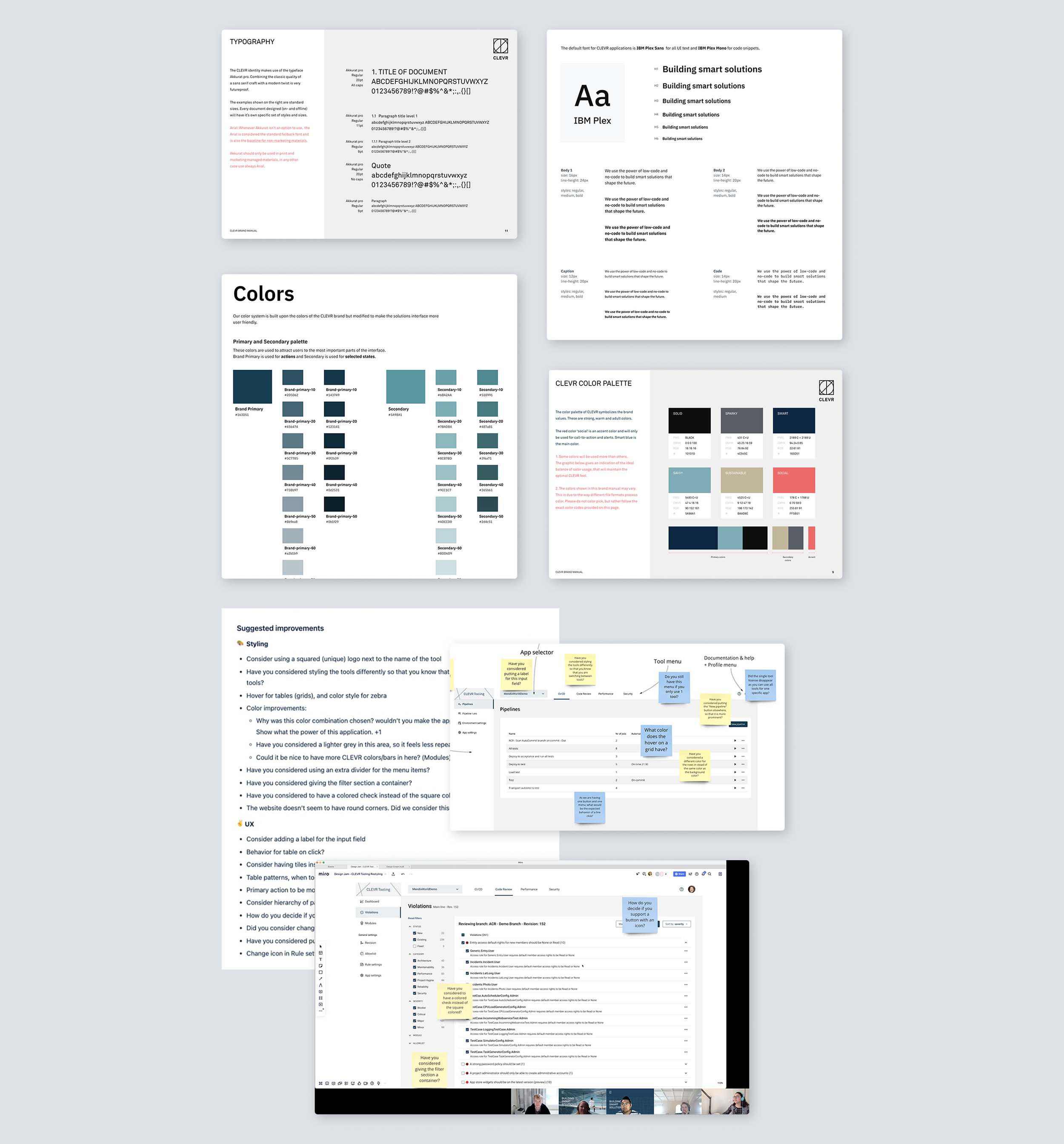
Establish a design language for user interfaces
Since the brand guide was created to promote the CLEVR brand mostly in a marketing context, there aren’t enough assets or guidance as to how to use it or extended it for product design. In collaboration with the Design Guild, we established a design language consisting of patterns and foundation styles specifically for digital interfaces.Feedback and testing workshops
As new concepts were designed, we organized workshops with designers and developers to get their feedback on styling, usability, and experience. Once we had agreed on final concepts we included users in our discussions to validate our assumptions before moving ahead with implementation.
Design System
Considering the application would continue to scale, we saw an opportunity to expand the new style guide into a Design System that could be used for our application and also shared with other development teams in the company, allowing them to quickly assemble consistent, user-friendly interfaces in a Mendix application.
Since CLEVR develops Mendix applications, the Design System had to match this framework, so all components and templates were based on Atlas UI, the front-end framework used in Mendix to build custom design systems.
Easy to modify theme variables
Since the brand guide was created to promote the CLEVR brand mostly in a marketing context, there aren’t enough assets or guidance as to how to use it or extended it for product design. In collaboration with the Design Guild, we established a design language consisting of patterns and foundation styles specifically for digital interfaces.Shared components and page templates
As new concepts were designed, we organized workshops with designers and developers to get their feedback on styling, usability, and experience. Once we had agreed on final concepts we included users in our discussions to validate our assumptions before moving ahead with implementation.Heuristics analysis
Using the screen audit we analyzed the overall usability of the platform and the consistency of common patterns to improve.

Lessons learned
Many of the ideas that the design worked on, could not be implemented since other requests from management or customers had to be prioritized and the team couldn't manage such a workload. There was an adjustment period for the team to learn how to plan and schedule design work.
Working closely with the developers in your team is fundamental when working around technical debt or complex systems. Together you can plan a way to introduce continuous improvements in the experience without overloading development and considering any technical constraints from the start.
And finally, when introducing new features in an application, remember that design work is not yet over. Work next to project management to determine measures of success and checkup points to validate your solutions. This is important even if you do user testing before release. Your team will gain confidence in their work and gain insights into how users interact with your application in real life, allowing you to optimize your designs even further.